I’ve been having interesting conversations with various Twitter folk lately about the kind of anime-related criticism they would like to read. One of the main things people said they wanted to see was more writing about the nitty gritties of the animation craft and how it impacts the viewer’s experience (obligatory reference here to the excellent Sakuga Blog, a new animation blog on the scene which all of you should check out pronto). For what it’s worth, I happen to agree with this assessment, but I’m not terribly educated about animation theory, and I don’t think that many anime fans are.
And this is okay! I don’t think you need to know theory to love and appreciate anime. But what if you want to convey to others how much you appreciate the animation craft, beyond just “the animation looked cool!” or “the voice acting was good!”? I think that most of us are aware that the visuals and sound impact the way we perceive the characters and narrative, but we lack the vocabulary to describe what exactly is going on. This can be frustrating when we’re trying to explain why we like (or don’t like) something about a work of art to another person.
Also, for critics who take themselves and their opinions seriously, this sort of thing should matter a lot. Pure formalism may not be a highly-regarded form of media criticism these days, but it does lay the important groundwork for any lens of analysis. So let’s not disregard it out of hand.
Since I’m a beginner too when it comes to animation theory, I figure we can learn about these things together. This post is about the basics of scene composition. I drew most of the information here from the revised edition Art in Motion: Animation Aesthetics by Maureen Furniss, which I think is a really well-written and accessible guide to the main issues in the field. I also encourage anyone with an education in animation theory to do us all a favour and leave a comment and/or some links to further reading. Your knowledge and insight would be very much appreciated!
(Note: While this post draws on general theories about animation, the examples I use are all from Japanese anime. While I’d love to discuss non-Japanese animation too, that’s a topic for other posts.)
What is the Mise-en-scène?
According to Elements of Cinema, the mise-en-scène is “the arrangement of everything that appears in the framing – actors, lighting, décor, props, costume.” A more comprehensive definition comes from Film Art: An Introduction by David Bordwell and Kristin Thompson, the go-to book for film studies undergrads:
In the original French, mise-en-scène (pronounced ‘meez-ahn-sen’) means ‘staging an action’, and it was first applied to the practice of directing plays. Film scholars, extending the term to film direction, use the term to signify the director’s control over what appears in the film frame. As you would expect from the term’s theatrical origins, mise-en-scène includes those aspects of film that overlap with the art of the theatre: setting, lighting, costume, and the behavior of the figures. In controlling the mise-en-scène, the director stages the event for the camera.
The analogy works for animation too. The animation director metaphorically “stages” the scene by controlling the placement of images, colours and lines. They also work with background artists and storyboard artists, who play major roles in shaping the layout of any given scene.

It’s important to note that everything in the animated mise-en-scène must be consciously woven into the frame, whether it is through hand-drawn animation, props, CG, or some combination of the above. There is nothing that can be “incidentally” caught in the frame. Meticulous film directors go to great lengths to control the set design, where the cameras are set up, and so on. But even they are strongly influenced by physical factors such as the weather, their level of access to certain locations and props, the size and abilities of their crew, etc. This is why people talk about film as a form of “heightened reality”, because even though much of it is staged and often supplemented by computer graphics, it is never completely divorced from the physical environment.
On the surface, it may sound as if animators are constrained only by their imaginations. Alas, this is not true. Putting aside the complicated debates among aesthetes around the relationship between “imagination” and “reality”, many animators – particularly in the world of commercial animation – are constrained by time, technology, number of able staff, and all sorts of other mundane and practical things. While this can lead to animation shortcuts, it can also inspire innovation and alternative forms of artistic expression, so it’s not entirely a bad thing.

That’s why any serious evaluation of an anime’s composition should take into account the circumstances in which it was made. What sort of tools did the studio use? Which parts were hand-drawn? Which parts were computer-assisted? How was the work delegated? To what extent was outsourcing a factor? These are only just some of the questions that can be asked.
With those important considerations in mind, let’s turn to the anime images themselves and explore some of the common considerations involved.
Character Design and Placement
While backgrounds and character designs are equally important when it comes to the aesthetics of animation, audiences generally remember the characters first and foremost – and not without good reason. Characters, in most cases, are the animation. They are the images that move. Because they are so pivotal to the success of a commercial anime, characters are usually placed in the foreground of any given shot.
That’s why long-distance shots like this tend to be brief…

And you get more mid-distance shots like this…

Closeups are also really popular in animation productions – especially quick cuts to exaggerated reaction faces. If you’re a regular anime viewer, you’ve probably seen a billion anime reaction faces by now.

While exaggerated reaction shots are used in live action as well (particularly in Japanese live action television, from my experience), they’re particularly effective in animation because cartoons generally try to achieve iconic representation over photorealism. A human body can be drawn like a realistic portrait (photorealistic) or as a stick figure (iconic), to give just two possible options. Anime characters in particularl may share basic anatomical features with humans and have enough distinct features to distinguish them from each other, but they also look like no human being that could actually exist.
So why does iconic representation work so well at conveying character and personality? In Understanding Comics, Scott McCloud argued that realistic characters remind the audience of a specific person or entity, while iconic designs are more like “every” person. This makes it easier for the audience to project their emotions onto the character.
This is not to say that realistic expressions and character animation are unimportant to animation, however. Replicating cinematic realism has been one of the chief aims of animation from its inception, and many animators go to the lengths of studying the laws of physics in order to convey realistic motion. And because detailed character animation can make a strong impression on audiences, perhaps it is little surprise that the camera is frequently kept static in the scenes that showcase the richest animation.
In the following scene from Evangelion, for instance, there are no camera pans: instead, the perspective switches between Shinji’s eyes and an omnipotent third person. Rei’s movements are conveyed with minute detail, while the backgrounds are kept deliberately drab and featureless. Like Shinji, our eyes cannot help but be drawn to her tiniest movements.
Backgrounds
As I mentioned before, however, backgrounds are just as important when it comes to crafting an effective scene. But first, let’s quickly go over the process of how backgrounds are created, because this aspect tends not to get as much attention in explanations of how the animation production line works.
A layout artist for Disney animated features described the role of the layout artist as akin to that of a Director of Photography in live action productions. This is pretty similar to what layout artists do in Japanese anime productions, although very few artists are credited specifically for this work. In the anime context, key animators work closely with the director in planning the basic structure of the backgrounds and where the characters are placed. In other words, it is during the layout stage that the meat and bones of a scene’s composition is carried out.
The backgrounds themselves are designed before the animation is produced. During the initial concept phase, the art director produces a series of drawings that best fits the image that the series director has in mind. A team of artists then works to create each specific background under the directions of the art director. As you can see, then, the backgrounds are an integral part of establishing an anime’s world or overall aesthetic. They are designed as the director is attempting to feel out the anime’s story, world and themes.

This part of the animation process is particularly influenced by fine art and painting styles. In fact, many independent artists such as Frédéric Back are drawn to animation as a means of bringing their fine art styles to life. While the need to create many paintings for a single TV episode rules out the use of acrylics and other more expensive paints in most commercial anime productions (even Ghibli uses poster paint), the end result can still look extremely detailed and very obviously inspired by well-known painting and architecture styles.
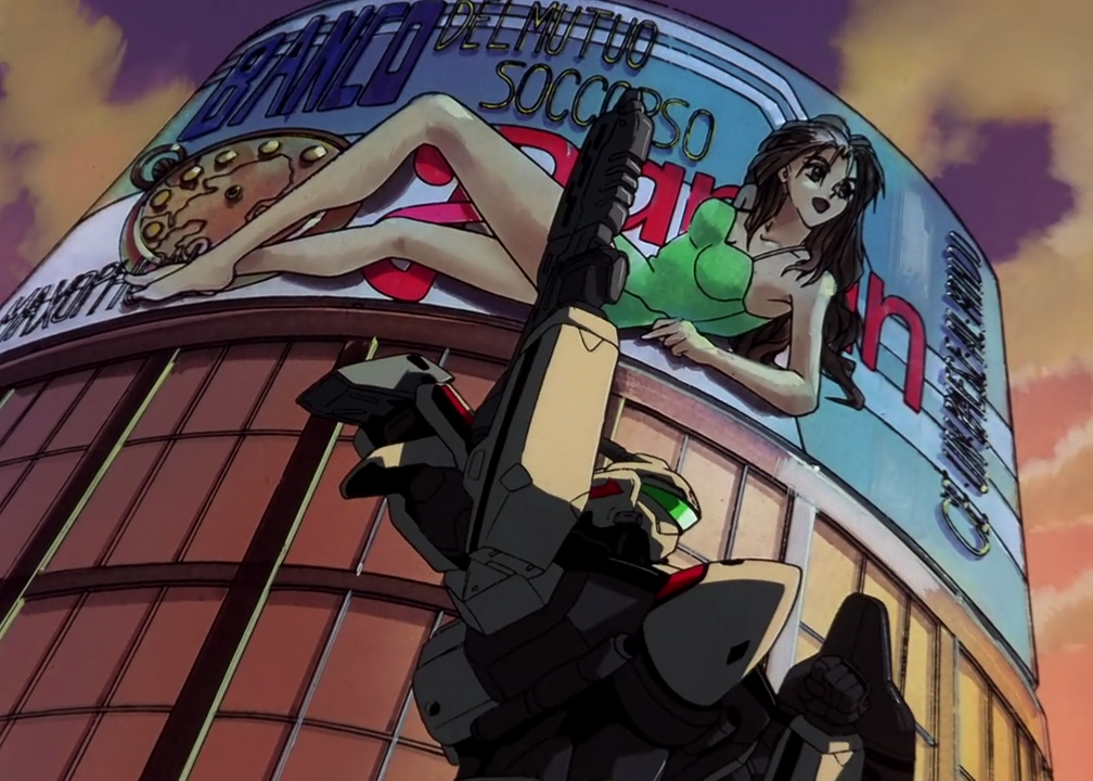
For example, the aesthetics in cyberpunk and/or dystopian anime are at least to some extent inspired by the Metabolist movement of postwar Japan. The Metabolists designed architecture that fused technological megastructures with smaller, detachable sections that could facilitate organic biological growth. It was basically a vision of urban utopia, although as metabolism fell out of vogue, science fiction creators reimagined the architectural style in dystopian works instead.
The influence is clear in the city of Olympus from Appleseed:

And also in Neon Genesis Evangelion:
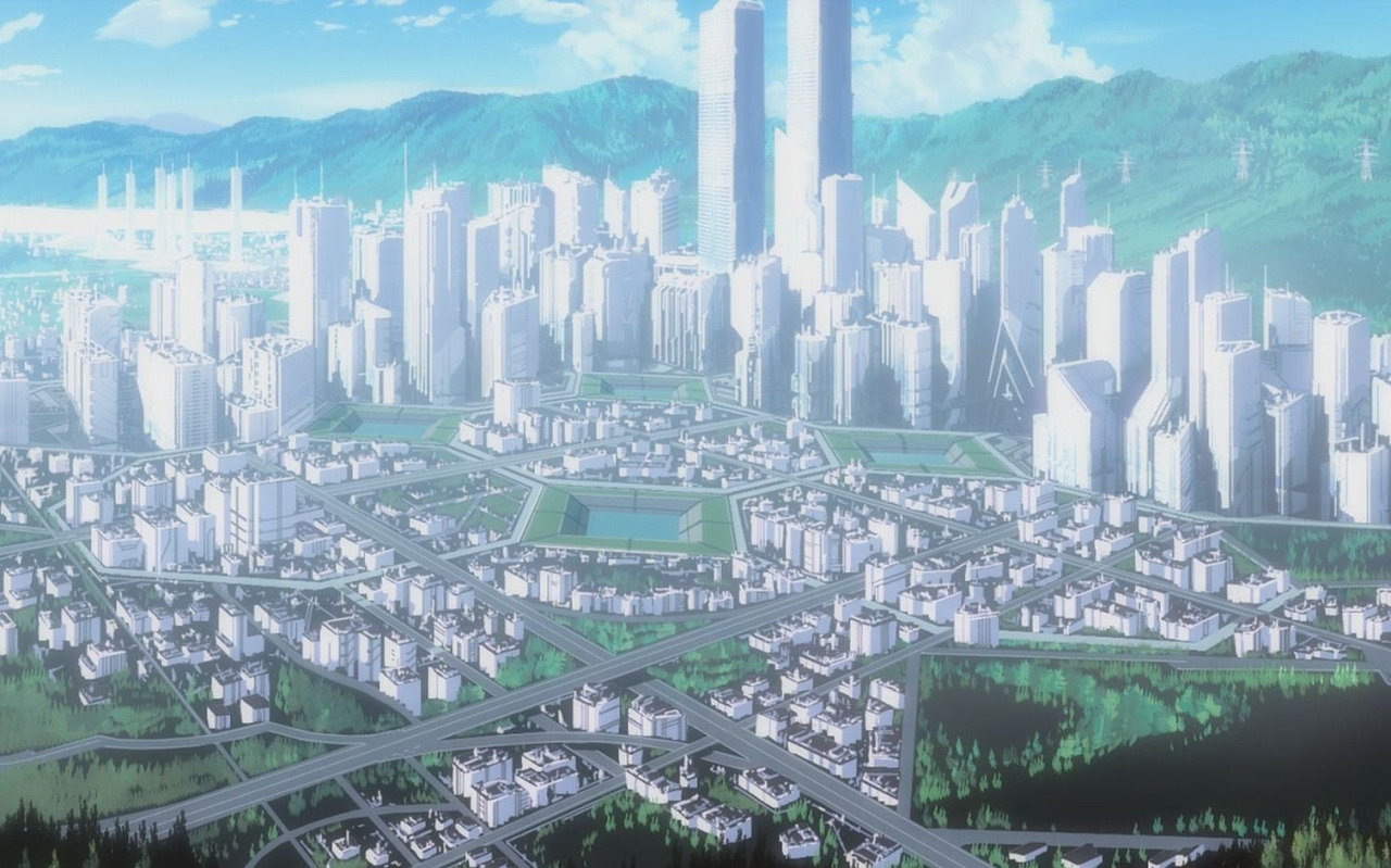
There is much more that can be said about anime art and architecture, but as you can see, a bit of interest in art history can help inform one’s evaluation of anime backgrounds and what sort of aesthetics they are trying to invoke.
Colour and Lighting
This section will get a little technical, so please bear with me.
As the Wikipedia page should tell you, colour derives from the spectrum of light. Our eyes can only detect a very small portion of the wavelengths on this spectrum. What we call the colour “blue” lies on the shorter end of the visible spectrum, while “red” lies on the longer end. All the colours we can see in nature are found somewhere on this spectrum.
For the purposes of artists, colour has three distinct qualities or dimensions: hue, value and intensity. You will need to know these words if you want to talk specifically about the colour choices in any work of art.
It is easiest to think of hue in terms of where a colour’s place on the colour wheel. In traditional colour theory, the primary colours are red, yellow and blue. They cannot be formed by any combination of other colours. You get secondary colours by mixing the primary colours, and you get tertiary colours by mixing a primary and a secondary colour. You can get a rough idea about which hues are close to each other by consulting the colour wheel:

The value of a colour refers to its gradation. Technically, black, white and the various shades of grey are not colours – they are values. Thus, in art, the value refers to how relatively light or dark a hue appears. A hue can seem lighter or darker depending on the degree to which the subject is illuminated or in shadow. A careful combination of light and dark hues can be used to indicate tension or emotional distress, a common strategy used throughout Hyouka:

Beginners tend to think of colours as distinct from lightness or darkness, but as we can see from carefully examining the above shot, parts of Satoshi’s face only appear darker because of where is positioned relative to the viewer’s perspective. It is clear that the light and dark dimensions belong to the same face. However, if Satoshi’s face were to be viewed in isolation from the rest of the shot, the different shades might look like different colours altogether. The dichotomy works effectively because the background is staged in such a way that the contrasting values feel like a natural part of the scene, lending it a sense of ambiance that could not have been achieved through character art alone.
Finally, the term intensity is used to describe the saturation of the colour scheme. Pure hues that appear on one end of the colour spectrum have a higher intensity. If you add a complementary hue – or the colour that appears on the opposite end of the colour wheel – you can lower the intensity and make it appear duller.
A few other words can help you describe colours. Some hues can be described as “warm”, such as yellow, orange and red. “Cool” hues are green, blue and violet. Warm colours serve to bring the viewer into the frame and stimulate them, while cool colours serve to distance them from the action and calm them.
We also have specific colour schemes. Most anime productions don’t stick to any one of these schemes consistently, but they may portray certain scenes or frames with a certain colour scheme in order to convey a certain stylistic effect.
A monochromatic colour scheme is built around one hue, with the addition of black and white to serve as shading. An analogous colour scheme uses hues from only one side of the colour spectrum. A complementary colour scheme is built around complements: yellow and violet, blue and orange, red and green, etc. All of them have different associated effects, and they can convey a different mood to the viewer depending on the context. For example, in the Monogatari visual below, the complementary colour scheme emphasises the conflicting sides of Senjougahara’s personality.

To put these different techniques into perspective, let’s look at how Norman McLaren, one of the greatest animators of all time, described how he combined colour and sound in animation production:
Low pitches I relate to colour of low-light values, irrespective of hue and chroma; high pitches to high-light values, irrespective of hue and chroma. In other words, I let dark browns, olives, rds, purples, blues predominate on the screen during a low-pitch passage, and use yellows, pale greens, pale oranges, very dark reds, purples, and blues during a high-pitched passage.
The timbre of the sound might sometimes determine which of these colours [is used]. To me it seems related to hue and possibly more so to the saturation or chroma of the colour. With a full-bodied passage I would tend to select a low-light-value colour, with a high chroma such as deep rich red, purple or blue; for a thin-bodied low-pitch passage I would chose a low-light-value colour with a low chroma, such as a deep brown, khaki or mustard. In other words, the fewer harmonies there are in the sound, the less saturation or chroma I tend to use; and the richer and more strident the sound the more intense the saturation.
While there’s evidently a deep level of careful thought behind his colour designs, McLaren also emphasised that he didn’t stick with this particular style all the time. In fact, he stated that all the theories are arbitrary, and that the ways people respond to pitch and colour are very subjective.
This is not an uncommon viewpoint among artists. The late Jules Engel once said that when it comes for a sense of how to use colour, “you either have it or you don’t.” And he’s right in the sense that even trained graphics artists tend to frame their stylist choices in terms of instinct or inspiration instead of adhering to a strict formula.
This obviously presents problems for viewers trying to analyse the technique. But really, if we can accept that the ways we respond to narratives and characters are deeply subjective, then we can also accept that there’s no “objective” way to evaluate colour and lighting either. We can highlight the use of certain colour and lighting choices in the context of a particular work, but they’re only one factor of many that shape your response to a work. Drawing attention to these technical aspects does not make you a more impartial reviewer, however tempting it might be to assume otherwise.
And just before you come to the conclusion that writing about colours makes for dull and dreary analysis, I’ll end this post with an excerpt from iblessall’s piece about Hyouka episode 22:

Where Chitanda is bathed in bright colors, Oreki stands awash in near-monochrome, awed. How pale and unsuited he seems in the presence of this girl. And when she casts her eyes upon him, they are controlled and commanding rather than large and engaging. He must not look away. He must follow.
Oreki is conscious of his helplessness before Chitanda, before this Other. His breathless thoughts tumble out, sounding like fear and like wonder and like love. It is not a rose-colored life that stands before him here, because reds dominate, breaking into frame after frame—the minions, the umbrella he carries, Chitanda’s costume.
It is as if the soft excitement of the rose-colored life has been swept away by the intensity and heat of this moment. Not pink, but red, but not but, instead and. And then they come upon the tree and red blends with cherry blossoms. Blues rush away like water, resistance melts into the river, and Oreki can’t see anything but her and it’s fear, it’s enchantment. It’s the Other. It’s liking and distraction and engagement. It’s everything all at once and it build, and builds, and builds, sweeping under the tree into a life of literal rose-color and curiosity and escaping isimpossible, the calm blue of the sky hidden from view and what can you do what can you do but watch listen see experience be until it overwhelms you and takes you away from everything you once knew and why weren’t you here before now what have you been missing you have to know you have to see you have to have until forever and
You’re called back to the world of mundane brown. To reality, with the mystical colors fading into the background. I cannot say more than that. This is something that cannot be broken apart into single shots because it is all one and the same thing. The same long moment.
Writing about animation doesn’t have to turn into bureaucratic filing. You can open your eyes to the techniques and craft and all the loving details – let them work their magic upon you. From there, you can go wherever you like.

I think FLCL is also a great example of this. On the outside of FLCL it’s just a whole bunch of randomness mixed with crazy character motions mixed with robots teleporting out of a kids head mixed with fooly coolying mixed with Hideaki Anno voice acting a cat! But FLCL does all this for its intended effect. I’ve only watched it once and I’m still figuring out what it all means so I can’t go that much into detail or use examples such as yours. However if you have seen FLCL then you probably know what I mean.
On a different topic, I read on one of your earlier posts that you are watching Gurren Lagann, which is also one of my favorite shows. When you are done with the show and only if you are interested, I know a fascinating analysis on Gurren Lagann that I think might be suited to your fancy (or however that saying goes). I’ll put the link here if you’re interested
Part 1 is a funny intro while part 2 is the actual analysis. Part 2 is about forty minutes long, just saying.
Oops, um, sorry about that. I put actual video in the comments. I was trying to just leave a link. But it didn’t seem to work. My bad.
It’s been a long time since I saw FLCL but I know what you mean. I think I’d appreciate the anime even more these days. Perhaps I’ll check it out again before the sequel comes out?
I’m still watching Gurren Lagann, but yes I’m enjoying it a lot so far. Thanks for the video link. I’ll watch it when I’m done.
(Forty minutes sounds like an awful lot of time for an analysis, though?? Is it written down somewhere?)
I’m sorry but I don’t think it’s written down. But the guy keeps it interesting all the way through (he claims to be “the best guy ever” after all). Sorry though.
Just a quick comment for the moment (or perhaps, this time):
For this part, when you say “director,” do you mean 「監督」 or episode director 「演出」? My understanding is that it’s the latter who works with the key animators on the layouts etc, though I could be mistaken…
In any case, I really loved this post, and desperately wish I had more time to engage with what you’ve written at the moment. I hope you’ll be doing more of these kinds of posts?
Yeah, I should have clarified. Both can be involved (depends on the project), but the episode director does much more of the heavy lifting. The episode director performs the checks and corrections and so on.
Of course, I could be mistaken myself! I’m only going off what I’ve read elsewhere (e.g. http://www.p-tina.net/itoso/200)
As for your other question, I’d really love to write more posts tackling anime from all sorts of directions. Some will focus on animation technique, while others will focus more on history and cultural context. I also want to write about anime production and influence in countries other than Japan.
Loved this post… I might give Hyouka another try later (dropped it after the first episode), because that image sequence felt really impressive.
Hyouka is amazing! You should definitely give it a shot if you love good animation. Imo the story/characters are good too :)
Well, I believe everyone loves good animation… However, by the first episode alone, Hyouka’s animation did not really seem to be my cup of tea… Like, the way they animated the chracters (especially Satoshi) felt like they were forcing the movement on the characters instead of letting it flow naturally. The impression I got was that KyoAni was trying to make the show very dynamic, at all costs, even when that meant sacrificing the purpose of the movement itself.
Things like this pulled me off:
But anyway, maybe I’m mistaken or maybe it gets better later, but my first impression of the show was not very good.
Ah, I sorta get what you mean. On my very first viewing of the show, I thought the visuals were overcompensating for the lack of actual meat in the story. This was only a problem that struck me in the first arc, and even then only during my first viewing. In the subsequent episodes, the written narrative and visual presentation are more in tune with each other. And even the first few episodes contain a lot of thematic richness that is easier to notice once you’ve seen the whole anime in perspective.
[…] to the scripting.” I also read some books and articles about animation theory and produced this post based on my […]
[…] Kim Morossy, The Basics of the Animated Mise-en-scène […]
[…] Kim Morrisey, The Basics of the Animated Mise-en-scène […]