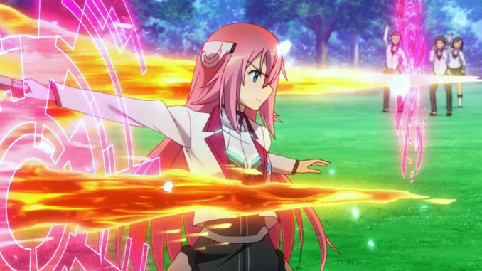
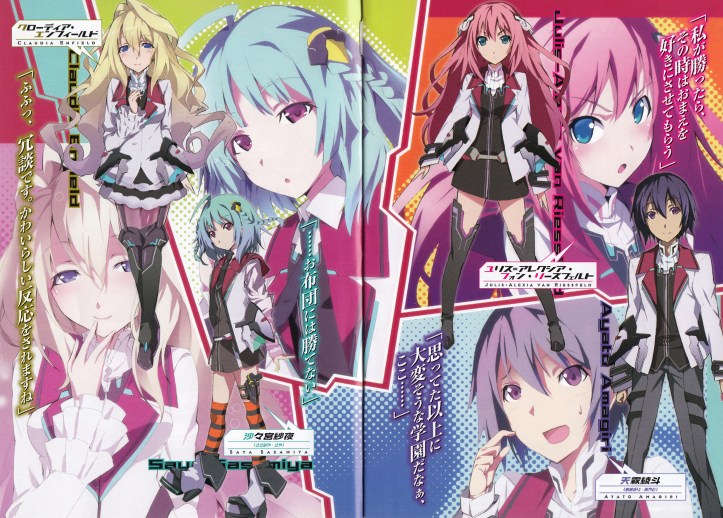
The Asterisk War was one of the most-watched shows on Crunchyroll in 2015. Now, before anyone goes on about the shit taste of the average Crunchyroll user, consider why viewers would have been drawn to the show beyond the magic high school premise.
The show looks pretty.
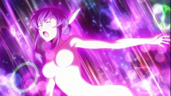
The bright, vivid colour palette is immediately striking, especially when the characters use their magical abilities. I haven’t actually watched the show myself, but the aesthetic looks so much more eye-catching than the likes of Absolute Duo and Magical Warfare. If you had to pick one magic high school show to watch from the key visuals, The Asterisk War has the visual personality to stand out in the crowd.
Colours are a huge part of the anime experience, and nobody knows that better than Aiko Matsuyama, the colour designer of The Asterisk War. She once said that the job is all about capturing the director and character designer’s vision. It’s also important to recreate the feel of the source material, because the viewer will notice if something is off.
As striking and as appealing as these visuals are, however, I personally don’t like them that much. The OP is a prime example of how the colours don’t really work that well in practice. They’re flashy, but the overly saturated colour scheme lacks consistency, especially when combined with special effects animation. Basically, it’s too much.
Bright colours make an anime stand out, but they don’t necessarily make it better. No Game No Life, for instance, was polarising for exactly the same reason; the extreme colour scheme may have been deliberate, but it can only be described as an assault to the senses.
Colour designs tend to work best when their strengths are invisible to the viewer; they ought to be eye-catching, but without drawing attention away from the overall composition of a shot. This is something that Matsuyama has noted and aspires towards. She has said that she can’t measure up to the woman who inspired her, and whose influence can be seen in the colour designs of The Asterisk War.
That person is Kumiko Nakayama, the colour designer of Macross Frontier.
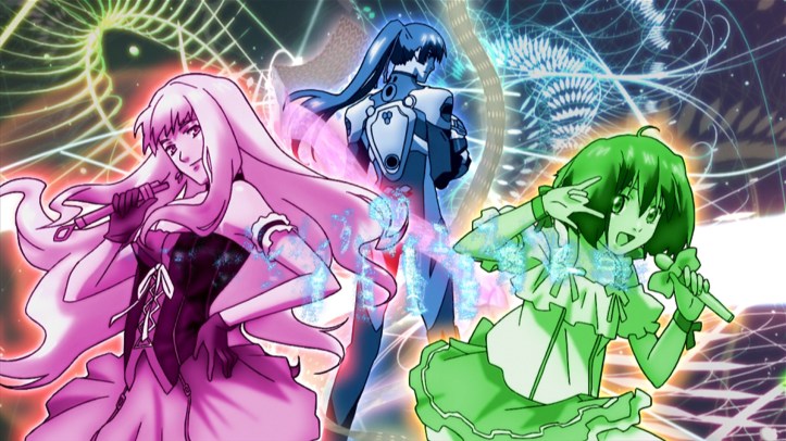
Despite airing ten years ago, the visuals of Macross Frontier continue to stand out to anime viewers. This arguably has more to do with its vivid colour scheme than with its key animation, which was prone to inconsistencies. The colours in Macross Frontier don’t overwhelm the viewer either; the show saves its brightest colours for the concert scenes, making the two divas stand out whenever they take to the stage.
The Wings of Goodbye movie looks even more beautiful. In the final concert/battle scene, the palette starts off dark but eventually gets brighter as the sun rises and the hero stages his stirring comeback. The colours always perfectly match the emotions of the scene, enhancing their impact.
Note: Spoilers in the clip below.
I think that one of the strongest things about Macross F is how the colours give consistency to the special effects and 3D animation. If you look at the 3D mecha designs on their own, they look as if they have no place in a 2D-animated show. But somehow, it all works way better than most shows with 3D mecha fights. Good colour coordination is a big reason why the CG doesn’t suck ass.
Colour coordinators typically work closely with the background director to ensure consistency across the entire board. If the CG objects and layouts integrate at all with the 2D animation, that’s because the artists have paid close attention to the overall colour palette and tone of the scene. You can see why colour directors often say that communication is the most important part of their job.
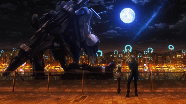
Aquarion EVOL (which Nakayama also handled the colour direction for) was really good at the 2D-3D integration too. In the shot above, the mech fits into the scene because you can see part of it reflecting the moon’s light. If you look closer, you might see that the mech stands out a bit too much against the city view in the background, but it’s subtle enough that it doesn’t detract from the striking beauty of the scene.
Watching Aquarion EVOL gave me a lot of respect for Nakayama – the show looks so darned pretty all the time. The colours are consistently eye-catching and attractive, but there’s always enough balance in the compositions to not make them distracting. Take the merging scenes, for instance. The characters turn naked and their bodies are encompassed with light, but there’s darkness in these sequences to create texture.
Compare this to something like Absolute Duo, which goes for a similar contrasting effect at key moments, but fails at integrating the colour scheme throughout the entire shot. The overall effect lacks depth, as if the character is simply pasted over the backgrounds.
Advancements in digital technology have made digital colouring easier, but in the end, good colouring still comes down to having a strong vision and a sensitivity to how colours and tones mesh with each other. Nakayama started off colouring cels, and even with the constraints of hand-drawn colouring, she was able to use a nuanced combination of colours to help create memorable shots.
Of course, these are just my subjective impressions, and you’re welcome to disagree with my opinions on which anime have good colours. Are there any anime that stand out to you, colour-wise?

SAO, of course. They struck design gold with Asuna and Kirito’s original Aincrad designs, and then Asuna’s design so much so that an entire guild was reverse-engineered with that white-with-red-trim aesthetic. Liz’s pink hair with dark red main color works wells with black and ark greys, which not only reflects her more forward personality, but also therefore is aesthetically pleasing when paired with Kirito. The whole gang as an ALO troupe follow the rainbow spectrum, they might as well be the Yuuki Yuuna magical girl troupe, lol.
So yeah, Aincrad was a perfect balance of color, with splashes of bright color to denote personality, but with plenty of darker tones to maintain the death game tensions. Lots of golden hour. ALO went a little too much color, not enough contrast, so we develop color-apathy like with Asterisk War.
GGO is mehhhhh, which is why Kirito gets a bright lightsaber and Sinon has bright blue hair and lighter greens in her design. Compare to Trigun’s gunslingers, with splashes of color to contrast with the otherwise dusty brown world, and then Vash himself with bright red and yellow to further stand out.
These are all really great observations. Are you a bit of a Kirito x Liz shipper, by any chance? ;)
Oh, and if you saw Ordinal Scale, what did you think of the colour scheme in that? I thought it looked rather subdued and that the atmosphere wasn’t quite the same as the SAO in the TV series. Still a great movie, though.
Nah, I like Kirito-Asuna. With a recent rewatch, I certainly saw the appeal, but I like the fellow-frontliners battle couple more.
The Ordinal Scale designs were quite good, too. The relative saturation on the color schemes make sense to me. The show has always made a point of contrasting the dull colors of meatspace to the vivid brightness of VR (to reflect how it’s a much more visceral experience to someone like Kirito), and so it fits that augmented reality is in the middle ground. The film also makes the point of therefore having the vivid colors of VR in their full glory during the climax, thematically fitting. The characters move from relatively stability but with some uncertainty about their futures (medium amounts of color), to full uncertainty due to the plot (even less color), and then find their resolve for the climax (full color).
Definitely No Game No Life! This was the first anime I had seen with SUPER bright imaging. I also think C3 and Amnesia do pretty well with their color selections. I think having bright colors is good but sometimes I feel like it is a little much. Like I know the anime wants to stand out but you don’t have to hurt the viewers eyes to do so lol
Pretty much agree with everything. Personally I tend to enjoy more softer and more muted color scheme, something like Mushishi or Haibane Renmei. I guess the only bright-colored anime that stood out in a good way for me was Mononoke.
Most watched, you say?? Because of the color. That sounds interesting, although really really weird.
What’s your thoughts on the full frontal assault of Akiyuki Shinbo’s style though? Because, yeah, I guess color does have a factor in people liking a show. It’s different, and it compliments his wacky progression.
Asterisk Wars above still looks pretty below average in terms of animation though, and I think bright colors like this deserve better animation quality, because the more I think about colors, the more I am reminded of Shiki and, yes, Aquarion Evol (Mix for life).
I don’t think people watched Asterisk Wars necessarily because of its colours, but it does make it stand out among other shows in its genre. Bear in mind that fantasy shows tend to well on anime streaming sites in general, so Asterisk Wars probably would have done well either way.
I quite like Akiyuki Shinbo’s stuff in the pre-Shaft days. Petite Cossette looks amazing with its gothic aesthetic. Shaft shows can be hit or miss for me, though.
Yes, the colors in the Macross F films are exceptional. Other standouts that come to mind are Kyousougiga, G-Reco, the Gael movie, and New Game!, just to stick to some recent examples.
And lolololol @ mentioned Absolute Duo, that show looked like garbage AND had the misfortune of being simulcast by Funi. Magical Warfare at least had crisp drawings…
Redline. It’s not just the use of color with that movie, though, but also the use of black – the black pen lines and bold black shading contrasted against the bright colors. I’m not an art expert so I don’t have any technical terms for it, but it feels very comic-book like in its style.
Supernatural The Animation, Redline, Casshern Sins and Bungou Stray Dogs are other anime with superb color design IMO.
I’m toying with the idea of sending this article to That Anime Snob. He needs to learn the importance of pretty colours.
for me an anime that uses color brilliantly is Nanbaka. The over the top bright colors add to the over the top comedy of the series
This show was ugly as hell, what were you smoking?